
Following is the list of 10 metrics which we’ll study in an interconnected way through examples:
- Confusion Matrix
- Type I Error
- Type II Error
- Accuracy
- Recall or True Positive Rate or Sensitivity
- Precision
- Specificity
- F1 Score
- ROC Curve- AUC Score
- PR Curve
Once we learn the appropriate usage and how to interpret these metrics according to your problem statement, then gauging the strength of a classification model becomes a cakewalk.
Let’s dive right in!
We’ll be using an example of a dataset having yes and no labels to be used to train a logistic regression model. This use case can be of any classification problem — spam detection, cancer prediction, attrition rate prediction, campaign target predictions, etc. We’ll be referring to special use-cases as and when required in this post. For now, we will take into consideration a simple logistic model which has to predict yes or no.
First things first, a logistic model can give two kinds of outputs:
1. It gives out class labels as output values (yes/no, 1/0, malignant/benign, attrited/retained, spam/not spam etc.)
2. It gives probability values between 0 to 1 as output values to signify how likely or how unlikely an event is for a particular observation.
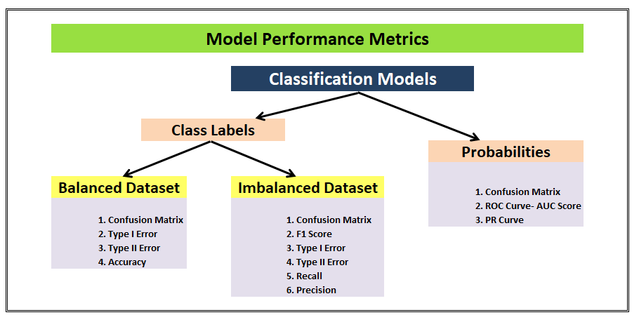
The class labels scenario can be further segmented into the cases of balanced or imbalanced datasets, both of these cannot be judged/should not be judged basis on similar metrics. Some metrics are more suited for but not another and vice-versa. Similarly, the Probabilities scenario has different model performance metrics than the class labels one.
Following is the flowchart which is a perfect summary as well as a perfect preface for this post, we will revisit this flowchart once again at the end to make sure we understand all the metrics.
1. Confusion Matrix
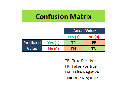
We start with a development dataset while building any statistical or ML model. Divide that dataset into 2 parts: Training and Test. Keep aside the test dataset and train the model using the training dataset. Once the model is ready to predict, we try making predictions on the test dataset. And once we segment the results into a matrix similar to as shown in the above figure, we can see how much our model is able to predict right and how much of its predictions are wrong.
We populate the following 4 cells with the numbers from our test dataset(having 1000 observations for instance).

- TP (True-positives): Where the actual label for that column was “Yes” in the test dataset and our logistic regression model also predicted “Yes”. (500 observations)
- TN (True-negatives): Where the actual label for that column was “No” in the test dataset and our logistic regression model also predicted “No”. (200 observations)
- FP (False-positives): Where the actual label for that column was “No” in the test dataset but our logistic regression model predicted “Yes”. (100 observations)
- FN (False-negatives): Where the actual label for that column was “Yes” in the test dataset but our logistic regression model predicted “No”. (200 observations)
These 4 cells constitute the “Confusion matrix” as in the matrix which can alleviate all the confusion about the goodness of our model by painting a clear picture of our model’s predictive power.
A confusion matrix is a table that is often used to describe the performance of a classification model (or “classifier”) on a set of test data for which the true values are known.
2. Type I Error

A type 1 error is also known as a false positive and occurs when a classification model incorrectly predicts a true outcome for an originally false observation.
For example: Let’s suppose our logistic model is working on a spam-not spam email use case. If our model is labeling an otherwise important email as spam then this is an example of Type I error by our model. In this particular problem statement, we are sensitive towards reducing the Type I error as much as possible because important emails going into the spam email can have serious repercussions.
3. Type II Error

A type II error is also known as a false negative and occurs when a classification model incorrectly predicts a false outcome for an originally true observation.
For example: Let’s suppose our logistic model is working on a use case where it has to predict if a person has cancer or not. If our model labels a person having cancer as a healthy person and misclassifies it, then this is an example of Type II error by our model. In this particular problem statement, we are very sensitive towards reducing the Type II error as much as possible because false negatives in this scenario may lead to death if the disease goes on to be undiagnosed in an affected person.
4. Accuracy
Now, the above three metrics discussed are General-purpose metrics irrespective of the kind of training and test data that you have and the kind of classification algorithm yu have deployed for your problem statements.
We are now moving towards discussing the metrics which are well suited for a particular type of data.
Let’s start talking about Accuracy here, this is a metric that is best used for a balanced dataset.

As you can see, a balanced dataset is one where the 1’s and 0’s, yes’s and no’s, positive and negatives are equally represented by the training data. On the other hand, if the ratio of the two class-labels is skewed then our model will get biased towards one category.
Assuming we have a Balanced dataset, let’s learn what is Accuracy.

Accuracy is the proximity of measurement results to the true value. It tell us how accurate our classification model is able to predict the class labels given in the problem statement.
For example: Let’s suppose that our classification model is trying to predict for customer attrition scenario. In the image above, Out of the total 700 actually attrited customers (TP+FN) , the model was correctly able to classify 500 attrited customers correctly (TP). Similarly, out of the total 300 retained customers (FP+TN), the model was correctly able to classify 200 retained customers correctly (TN).
Accuracy= (TP+TN)/Total customers
In the above scenario, we see that the accuracy of the model on the test dataset of 1000 customers is 70%.
Now, we learned that Accuracy is a metric that should be used only for a balanced dataset. Why is that so? Let’s look at an example to understand that.

In this example, this model was trained on an imbalanced dataset and even the test dataset is imbalanced. The Accuracy metric has a score of 72% which might give us the impression that our model is doing a good job at the classification. But, look closer, this model is doing a terrible job out of predicting the Negative class labels. It only predicted 20 correct outcomes out of 100 total negative label observations. This is why the Accuracy metric should not be used if you have an imbalanced dataset.
The next question is, then what is to be used if you have an imbalanced dataset? The answer is Recall and Precision. Let’s learn more about these.
5. Recall/ Sensitivity/ TPR

Recall/ Sensitivity/ TPR (True Positive Rate) attempts to answer the following question:
What proportion of actual positives was identified correctly?

This metric gives us 78% as the Recall score in the above image. Recall is generally used in use cases where the truth-detection is of utmost importance. For example: The cancer prediction, the stock market classification, etc. over here the problem statement requires that the False negatives be minimized which implies Recall/Sensitivity be maximized.
6. Precision

Precision attempts to answer the following question:
What proportion of positive identifications was actually correct?
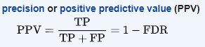
The example shown in the above image shows us that the Precision score is 75%. Precision is generally used in cases where it’s of utmost importance not to have a high number of False positives. For example: In spam detection cases, as we discussed above, a false positive would be an observation that was not spam but was classified as Spam by our classification model. Too many of the false positives can defeat the purpose of a spam classifier model. Thus, Precision comes handy here to judge the model performance in this scenario.
7. Specificity

Specificity (also called the true negative rate) measures the proportion of actual negatives that are correctly identified as such.
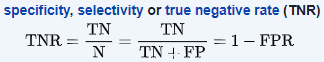
Building on the same spam detection classifier example which we took to understand Precision. Specificity tells us how many negatives our model was able to accurately classify. In this example, we see that specificity =33%, this is not a good score for a spam detection model as this implies majority of non-spam emails are getting wrongly classified as spam. We can derive the conclusion that this model needs improvement by looking at the specificity metric.
8. F1 Score
We talked about Recall and Precision in points numbers 6 and 7 respectively. We understand that there are some problem statements where a higher Recall takes precedence over a higher Precision and vice-versa.
But there are some use-cases, where the distinction is not very clear and as developers, we want to give importance to both Recall and Precision. In this case, there is another metric- F1 Score that can be used. It is dependent on both Precision and Recall.
In a statistical analysis of binary classification, the F1 score (also F-score or F-measure) is a measure of a test’s accuracy. It considers both the precision p and the recall r of the test to compute the score

Before moving to the last two metrics, the following is a good summary table provided on Wikipedia that covers all the metrics we have discussed until now in this post. Zoom in to see if the image seems unclear.

Now, we are at the last leg of this post. Until now we have discussed the model performance metrics for classification models that predict class labels. Now, let’s study the metrics for the models which operate basis on the probabilities.
9. ROC Curve- AUC Score
Area under the Curve (AUC), Receiver Operating Characteristics curve (ROC)
This is one of the most important metrics used for gauging the model performance and is widely popular among the data scientists.
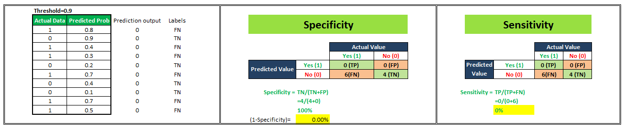
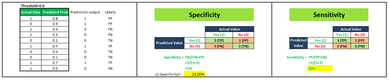
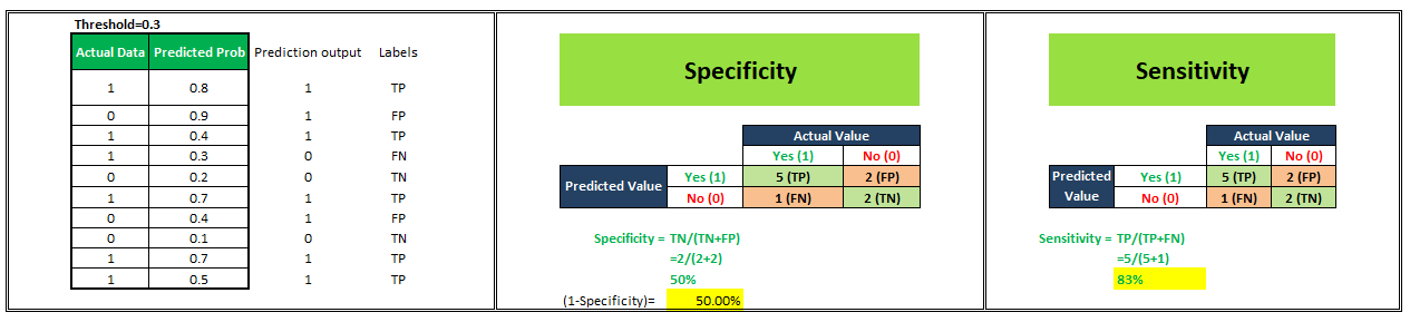
Let’s start understanding this with an example. We have a classification model that gives probability values ranging between 0–1 to predict the probability of a person being obese or not. Probability score near 0 indicates a very low probability that the person under consideration is obese whereas probability values near 1 indicate a very high probability of a person being obese. Now, by default if we consider a threshold of 0.5 then all the people assigned probabilities ≤0.5 will be classified as “Not Obese” and people assigned probabilities >0.5 will be classified as “Obese”. But, we can vary this threshold. What if I make it 0.3 or 0.9. Let’s see what happens.
For simplicity in understanding, we have taken 10 people in our sample.
To plot a ROC curve, we have to plot (1-Specificity) i.e. False Positive Rate on x-axis and Sensitivity i.e. True Positive Rate on the y-axis.
ROC (Receiver Operating Characteristic) Curve tells us about how good the model can distinguish between two things (e.g If a patient is obese or not). Better models can accurately distinguish between the two. Whereas, a poor model will have difficulties in distinguishing between the two.
We’ll see 4 different scenarios wherein we are going to select different values of the threshold and will calculate corresponding x and y-axis values for the ROC curve.

Now, we have 4 data points with the help of which we’ll plot our ROC Curve as shown below.

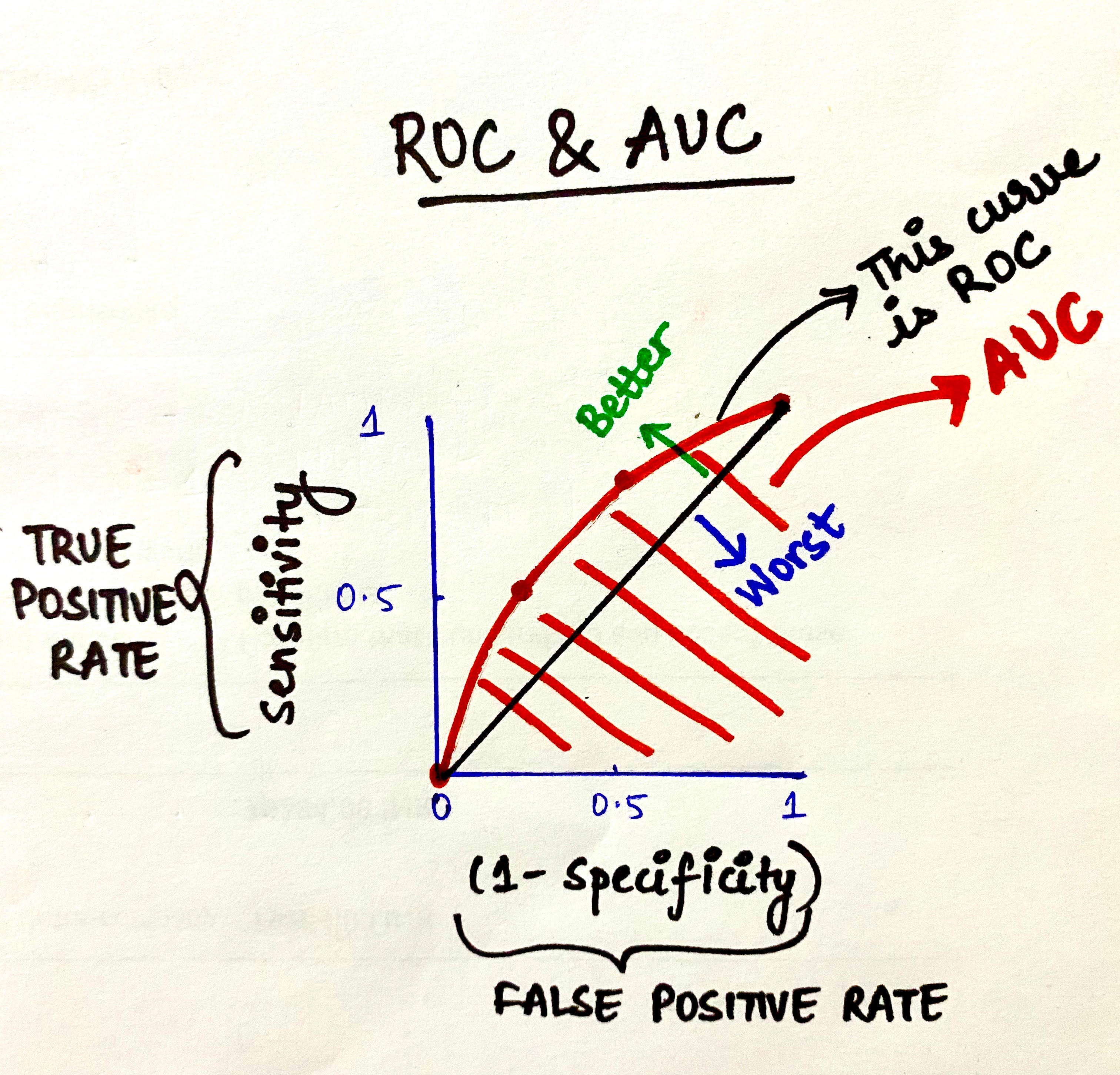
Thus, this is how ROC Curves can be plotted for a classification model by assigning its different thresholds to create different data points to generate the ROC Curve. The area under the ROC curve is known as AUC. The more the AUC the better your model is. The farther away your ROC curve is from the middle linear line, the better your model is. This is how ROC-AUC can help us judge the performance of our classification models as well as provide us a means to select one model from many classification models.
10. PR Curve
In cases where the data is located mostly in the negative label, the ROC-AUC will give us a result that will not be able to represent the reality much because we primarily focus on a positive rate approach, TPR on y-axis and FPR on the x-axis.
For instance, look at the example below:

Over here you can see that most of the data lie under the negative label and ROC-AUC will not capture that information. In these kinds of scenarios, we turn to PR curves which are nothing but the Precision-Recall curve.
In a PR curve, we’ll calculate and plot Precision on Y-axis and Recall on X-axis to see how our model is performing.
That’s it! We have reached the end of this post. I hope it was helpful.