Click here for Pre-Assessment
Dataset:
- Download Financial-Data Files.
Hints:
Transformation:
- Check all data type
- Create Date table
- Create New Measurements
- Total Sales [Sum of Sales]
- Total Margin [Sum of Profit]
- Total COGS [Sum of COGS]
- Sales vs COGS [Total Sales – Total COGS]
- Profit % [Total Margin / Total COGS]
- Average Order [Total Sales / Total Number of Row*(use COUNTROWS Function)]
Modeling :
- Create Relationship between Financial & Date table
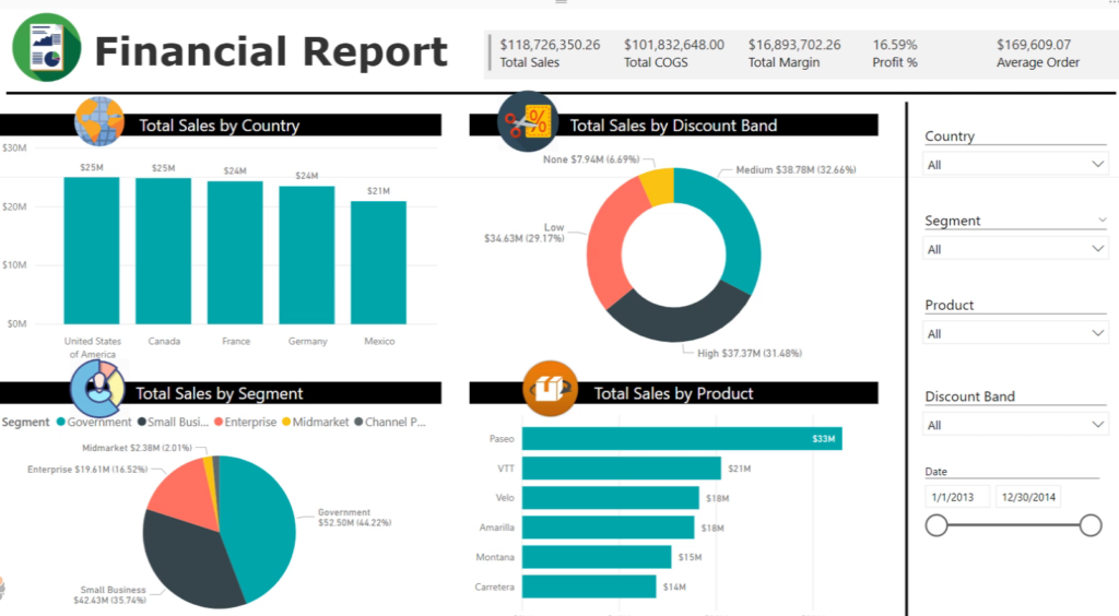
Your manager wants to see a report on your latest sales figures. They’ve requested an executive summary of:
- Which month and year had the most profit?
- Where is the company seeing the most success (by country)?
- Which product and segment should the company continue to invest in?
- Top 2 profitable Products.
- What is the Total sales without discount?
- Find Country-wise Sales %.
- What is the Product-wise Profit Margin % ?
- What is the Year to Date Sales Value?
- Need to find YoY Sales Growth
Note:
- Montana product was discontinued last month.
- All Segment Name Need to show in Uppercase
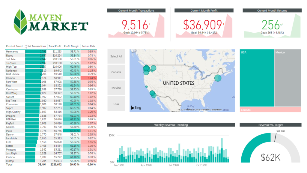
The Delicious Pizza and Financial Reporting clients were so impressed by your work that they referred you for another contract. This time you will be working with Maven Market, a multi-national grocery chain with locations in Canada, Mexico and the United States. They are asking your Data Analysis and Visualization expertise to do a report, like below:
Dataset:
- Download Maven Market Files
Instructions:
Step1: Connecting and Shaping the Data
Open a new Power BI Desktop file, and complete the following steps:
1) Update your Power BI options and settings as follows:
- Deselect the “Autodetect new relationships after data is loaded” option in the Data Load tab
- Make sure that Locale for import is set to “English (United States)” in the Regional Settings tab
2) Connect to the MavenMarket_Customers csv file
- Name the table “Customers“, and make sure that headers have been promoted
- Confirm that data types are accurate (Note: “customer_id” should be whole numbers, and both “customer_acct_num” and “customer_postal_code” should be text)
- Add a new column named “full_name” to merge the the “first_name” and “last_name” columns, separated by a space
- Create a new column named “birth_year” to extract the year from the “birthdate” column, and format as text
- Create a conditional column named “has_children” which equals “N” if “total_children” = 0, otherwise “Y“
3) Connect to the MavenMarket_Products csv file
- Name the table “Products” and make sure that headers have been promoted
- Confirm that data types are accurate (Note: “product_id” should be whole numbers, “product_sku” should be text), “product_retail_price” and “product_cost” should be decimal numbers)
- Use the statistics tools to return the number of distinct product brands, followed by distinct product names
- Spot check: You should see 111 brands and 1,560 product names
- Add a calculated column named “discount_price“, equal to 90% of the original retail price
- Format as a fixed decimal number, and then use the rounding tool to round to 2 digits
- Select “product_brand” and use the Group By option to calculate the average retail price by brand, and name the new column “Avg Retail Price”
- Spot check: You should see an average retail price of $2.18 for Washington products, and $2.21 for Green Ribbon
- Delete the last applied step to return the table to its pre-grouped state
- Replace “null” values with zeros in both the “recyclable” and “low-fat” columns
4) Connect to the MavenMarket_Stores csv file
- Name the table “Stores” and make sure that headers have been promoted
- Confirm that data types are accurate (Note: “store_id” and “region_id” should be whole numbers)
- Add a calculated column named “full_address“, by merging “store_city“, “store_state“, and “store_country“, separated by a comma and space (hint: use a custom separator)
- Add a calculated column named “area_code“, by extracting the characters before the dash (“-“) in the “store_phone” field
5) Connect to the MavenMarket_Regions csv file
- Name the table “Regions” and make sure that headers have been promoted
- Confirm that data types are accurate (Note: “region_id” should be whole numbers)
6) Connect to the MavenMarket_Calendar csv file
- Name the table “Calendar” and make sure that headers have been promoted
- Use the date tools in the query editor to add the following columns:
- Start of Week (starting Sunday
- Name of Day
- Start of Month
- Name of Month
- Quarter of Year
- Year
7) Connect to the MavenMarket_Returns csv file
- Name the table “Return_Data” and make sure that headers have been promoted
- Confirm that data types are accurate (all ID columns and quantity should be whole numbers)
Step2: Creating the Data Model
1) In the RELATIONSHIPS view, arrange your tables with the lookup tables above the data tables
-
Connect Transaction_Data to Customers, Products, and Stores using valid primary/foreign keys
-
Connect Transaction_Data to Calendar using both date fields, with an inactive “stock_date” relationship
-
Connect Return_Data to Products, Calendar, and Stores using valid primary/foreign keys
-
Connect Stores to Regions as a “snowflake” schema
2) Confirm the following:
-
All relationships follow one-to-many cardinality, with primary keys (1) on the lookup side and foreign keys (*) on the data side
-
Filters are all one-way (no two-way filters)
-
Filter context flows “downstream” from lookup tables to data tables
-
Data tables are connected via shared lookup tables (not directly to each other)
3) Hide all foreign keys in both data tables from Report View, as well as “region_id” from the Stores table
4) In the DATA view, complete the following:
-
Update all date fields (across all tables) to the “M/d/yyyy” format using the formatting tools in the Modeling tab
-
Update “product_retail_price“, “product_cost“, and “discount_price” to Currency ($ English) format
-
In the Customers table, categorize “customer_city” as City, “customer_postal_code” as Postal Code, and “customer_country” as Country/Region
-
In the Stores table, categorize “store_city” as City, “store_state” as State or Province, “store_country” as Country/Region, and “full_address” as Address
5) Save your .pbix file
Step3: Adding the DAX Measures
1) In the DATA view, add the following calculated columns:
- In the Calendar table, add a column named “Weekend”
- Equals “Y” for Saturdays or Sundays (otherwise “N“)
- In the Calendar table, add a column named “End of Month”
- Returns the last date of the current month for each row
- In the Customers table, add a column named “Current Age”
- Calculates current customer ages using the “birthdate” column and the TODAY() function
- In the Customers table, add a column named “Priority”
- Equals “High” for customers who own homes and have Golden membership cards (otherwise “Standard“)
- In the Customers table, add a column named “Short_Country”
- Returns the first three characters of the customer country, and converts to all uppercase
- In the Customers table, add a column named “House Number”
- Extracts all characters/numbers before the first space in the “customer_address” column (hint: use SEARCH)
- In the Products table, add a column named “Price_Tier”
- Equals “High” if the retail price is >$3, “Mid” if the retail price is >$1, and “Low” otherwise
- In the Stores table, add a column named “Years_Since_Remodel”
- Calculates the number of years between the current date (TODAY()) and the last remodel date
2) In the REPORT view, add the following measures (Assign to tables as you see fit, and use a matrix to match the “spot check” values)
- Create new measures named “Quantity Sold” and “Quantity Returned” to calculate the sum of quantity from each data table
- Spot check: You should see total Quantity Sold = 833,489 and total Quantity Returned = 8,289
- Create new measures named “Total Transactions” and “Total Returns” to calculate the count of rows from each data table
- Spot check: You should see 269,720 transactions and 7,087 returns
- Create a new measure named “Return Rate” to calculate the ratio of quantity returned to quantity sold (format as %)
- Spot check: You should see an overall return rate of 0.99%
- Create a new measure named “Weekend Transactions” to calculate transactions on weekends
- Spot check: You should see 76,608 total weekend transactions
- Create a new measure named “% Weekend Transactions” to calculate weekend transactions as a percentage of total transactions (format as %)
- Spot check: You should see 28.4% weekend transactions
- Create new measures named “All Transactions” and “All Returns” to calculate grand total transactions and returns (regardless of filter context)
- Spot check: You should see 269,720 transactions and 7,087 returns across all rows (test with product_brand on rows)
- Create a new measure to calculate “Total Revenue” based on transaction quantity and product retail price, and format as $ (hint: you’ll need an iterator)
- Spot check: You should see a total revenue of $1,764,546
- Create a new measure to calculate “Total Cost” based on transaction quantity and product cost, and format as $ (hint: you’ll need an iterator)
- Spot check: You should see a total cost of $711,728
- Create a new measure named “Total Profit” to calculate total revenue minus total cost, and format as $
- Spot check: You should see a total profit of $1,052,819
- Create a new measure to calculate “Profit Margin” by dividing total profit by total revenue calculate total revenue (format as %)
- Spot check: You should see an overall profit margin of 59.67%
- Create a new measure named “Unique Products” to calculate the number of unique product names in the Products table
- Spot check: You should see 1,560 unique products
- Create a new measure named “YTD Revenue” to calculate year-to-date total revenue, and format as $
- Spot check: Create a matrix with “Start of Month” on rows; you should see $872,924 in YTD Revenue in September 1998
- Create a new measure named “60-Day Revenue” to calculate a running revenue total over a 60-day period, and format as $
- Spot check: Create a matrix with “date” on rows; you should see $97,570 in 60-Day Revenue on 4/14/1997
- Create new measures named “Last Month Transactions“, “Last Month Revenue“, “Last Month Profit“, and “Last Month Returns”
- Spot check: Create a matrix with “Start of Month” on rows to confirm accuracy
- Create a new measure named “Revenue Target” based on a 5% lift over the previous month revenue, and format as $
- Spot check: You should see a Revenue Target of $99,223 in March 1998
Step4: Building the Report
1) Rename the tab “Topline Performance” and insert the Maven Market logo
2) Insert a Matrix visual to show Total Transactions, Total Profit, Profit Margin, and Return Rate by Product_Brand (on rows)
- Add conditional formatting to show data bars on the Total Transactions column, and color scales on Profit Margin (White to Green) and Return Rate (White to Red)
- Add a visual level Top N filter to only show the top 30 product brands, then sort descending by Total Transactions
3) Add a KPI Card to show Total Transactions, with Start of Month as the trend axis and Last Month Transactions as the target goal
- Update the title to “Current Month Transactions“, and format as you see fit
- Create two more copies: one for Total Profit (vs. Last month Profit) and one for Total Returns (vs. Last Month Returns)
- Make sure to update titles, and change the Returns chart to color coding to “Low is Good“
4) Add a Map visual to show Total Transactions by store city
- Add a slicer for store country
- Under the “selection controls” menu in the formatting pane, activate the “Show Select All” option
- Pro Tip: Change the orientation in the “General” formatting menu to horizontal and resize to create a vertical stack (rather than a list)
5) Next to the map, add a Treemap visual to break down Total Transactions by store country
- Pull in store_state and store_city beneath store_country in the “Group” field to enable drill-up and drill-down functionality
6) Beneath the map, add a Column Chart to show Total Revenue by week, and format as you see fit
- Add a report level filter to only show data for 1998
- Update the title to “Weekly Revenue Trending“
7) In the lower right, add a Gauge Chart to show Total Revenue against Revenue Target (as either “target value” or “maximum value”)
- Add a visual level Top N filter to show the latest Start of Month
- Remove data labels, and update the title to “Revenue vs. Target“
8) Select the Matrix and activate the Edit interactions option to prevent the Treemap from filtering
9) Select “USA” in the country slicer, and drill down to select “Portland” in the Treemap
- Add a new bookmark named “Portland 1000 Sales“
- Add a new report page, named “Notes“
- Insert a text box and write something along the lines of “Portland hits 1,000 sales in December“
- Add a button (your choice) and use the “Action” properties to link it to the bookmark you created
- Test the bookmark by CTRL-clicking the button
- Find 2-3 additional insights from the Topline Performance tab and add new bookmarks and notes linking back
10) Get creative! Practice creating new visuals, pages, or bookmarks to continue exploring the data!
Click here for Post-Assessment
Book
Blog Links for Choosing Right Chart
- Painting the big picture – Big Data and Data Analytics
- The Data Analytics Process
- Introduction to Machine Learning
- Hands-on
- Analytics(Machine Learning) with Orange
- Exploratory Data Analysis and Linear Regression-Prediction
- Logistic Regression-Prediction
Presentation File:
Related Materials:
-
Machine Learning Analytics with Less Code or No Code
Using Orange Data Mining Tool. Download from here : https://orangedatamining.com/download/#windows
- Data Concept
- To know more about Data Concept you can click [this] link.
- ML Performance Metrics
Click here for Pre-Assessment
Predicting Used Car Prices
The Problem
The prices of new cars in the industry is fixed by the manufacturer with some additional costs incurred by the Government in the form of taxes. So, customers buying a new car can be assured of the money they invest to be worthy. But due to the increased price of new cars and the incapability of customers to buy new cars due to the lack of funds, used cars sales are on a global increase (Pal, Arora and Palakurthy, 2018). There is a need for a used car price prediction system to effectively determine the worthiness of the car using a variety of features. Even though there are websites that offers this service, their prediction method may not be the best. Besides, different models and systems may contribute on predicting power for a used car’s actual market value. It is important to know their actual market value while both buying and selling.
The Client
To be able to predict used cars market value can help both buyers and sellers.
Used car sellers (dealers): They are one of the biggest target group that can be interested in results of this study. If used car sellers better understand what makes a car desirable, what the important features are for a used car, then they may consider this knowledge and offer a better service.
Online pricing services: There are websites that offers an estimate value of a car. They may have a good prediction model. However, having a second model may help them to give a better prediction to their users. Therefore, the model developed in this study may help online web services that tells a used car’s market value.
Individuals: There are lots of individuals who are interested in the used car market at some points in their life because they wanted to sell their car or buy a used car. In this process, it’s a big corner to pay too much or sell less then it’s market value.
The Data
The data used in this project was downloaded from Kaggle. It was uploaded on Kaggle by Austin Reese who Kaggle.com user. Austin Reese scraped this data from craigslist with non-profit purpose. It contains most all relevant information that Craigslist provides on car sales including columns like price, condition, manufacturer, latitude/longitude, and 22 other categories.
Dataset Collected from here : https://www.kaggle.com/austinreese/craigslist-carstrucks-data
CSV datafile: Automobile price data _Raw_
Solution
There are two ways we can do this; either we can solve this with Azure ML Designer (No Code) way or We can do this using python notebook.
- Let’s do this using Azure ML Designer (Azure ML Studio -Classic)
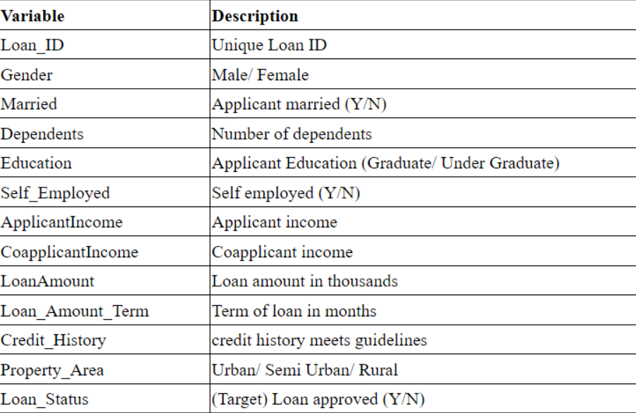
Loan Prediction Problem
The Problem
Dream Housing Finance company deals in all kinds of home loans. They have a presence across all urban, semi-urban and rural areas. The customer first applies for a home loan and after that, the company validates the customer eligibility for the loan.
The company wants to automate the loan eligibility process (real-time) based on customer detail provided while filling out online application forms. These details are Gender, Marital Status, Education, number of Dependents, Income, Loan Amount, Credit History, and others. To automate this process, they have provided a dataset to identify the customer segments that are eligible for loan amounts so that they can specifically target these customers.
As mentioned above this is a Binary Classification problem in which we need to predict our Target label which is “Loan Status”.
Loan status can have two values: Yes or NO.
Yes: if the loan is approved
NO: if the loan is not approved
So using the training dataset we will train our model and try to predict our target column that is “Loan Status” on the test dataset.
The Data
So train and test dataset would have the same columns except for the target column that is “Loan Status”.
Train dataset: KYC
Click here for Post-Assessment